As rising juniors and seniors “raced” to find out if they would be able to live on campus this year, N.C. Central University sent out an email detailing drastic changes to the university’s brand.
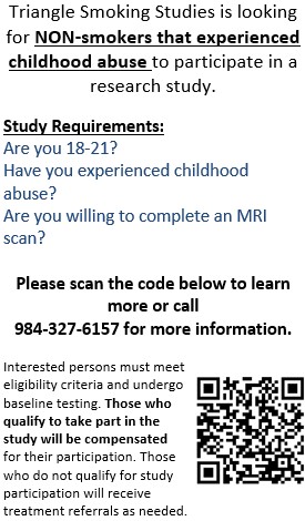
The most notable of those changes is the new logo, which students and alumni online have condemned as more befitting of an online university or healthcare facility. NCCU sees the six-parallelogram design as a representation of both “quoins” — an external angle of a building that, when modeled off of the Hoey Administration Building, signifies “permanence and strength” — and eagle’s wings in relation to the university mascot.
“Simply put,” the news story on NCCU’s website reads, “this symbol is both foundational and inspirational.”
This is hardly the first time that the university has rebranded itself. Prior to its current incarnation, the university has been (in chronological order since 1910) National Religious Training School and Chautauqua for the Colored Race, Durham State Normal School, North Carolina College for Negroes and North Carolina College at Durham.
Still, some current and former students see these changes as a slap in the face to tradition, with one Facebook commenter calling it “the gentrification of my dear [NCCU].”
While the response to the new logo, brand sheet and tagline — “Discover what’s Central to you” — has been negative, work to attempt to reverse the rebranding has been civil and overall positive.
A Change.org petition, created by a user called “NCCU Logo Change” and reaching out to students, alumni and the surrounding Durham community, has over 2,000 signatures asking for the university to move toward a brand that is “a true representation of a university founded on Truth & Service.”
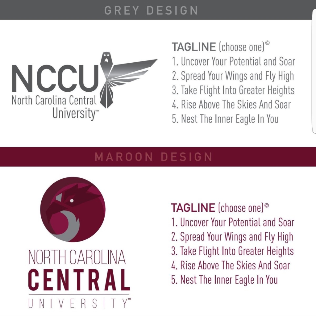
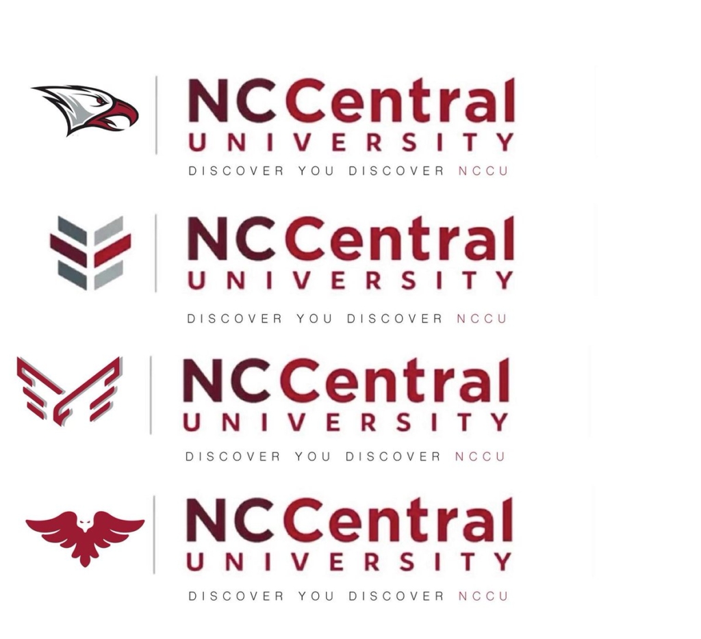
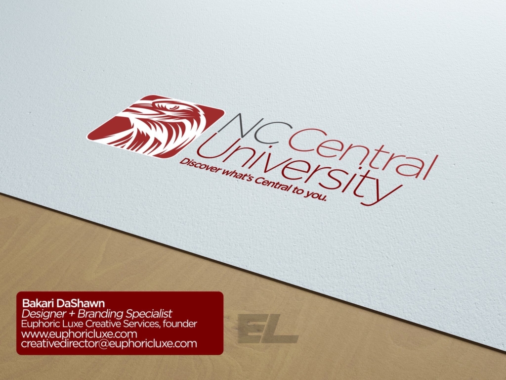
SGA Student Body President-elect Davanta Parker called for students and alumni to submit logo designs of their own for resubmission in place of the new one. So far, Parker has received and retweeted six different designs (pictured above), but no finite plan is in place for reconsidering the current logo, much less changing it to one of the designs Parker has curated.
Plans to change NCCU’s logo and tagline have been in place since 2016, but it is now driven primarily by being one of the chancellor’s 2017-18 Eagle Promise Priorities and Strategies handled by the Office of Communications and Marketing. Other areas of interest under “Improve NCCU’s Brand and Reputation to Embrace Student Success and Offer Multiple Access Points for Students Seeking Higher Education” include reconstructing the university’s website, expanding the university’s distance (online) education portfolio and increasing corporate support by 7 percent.
You can review the new university brand sheet — complete with an explanation of the changes — here.

